Burndown vs Burnup: What’s the Difference?
The Prelude to Burndown and Burnup Charts
The world of project management is laced with complexities that require refined tools to navigate. Attending to the nuances of project progress, potential setbacks, and the overall project trajectory is of paramount importance. In this labyrinth of responsibilities, two specific tools have emerged as nonpareil aids to project managers globally – burndown and burnup charts. These practical yet potent tools provide insightful visual representations of data, which can help Agile teams make strategic decisions and course corrections if necessary. Regardless of their shared objective – to help track progress – each chart tells a different narrative about the project’s evolution. Let’s kick things off by delving into these diagrams and their distinct capabilities.
Understanding the Burndown Chart
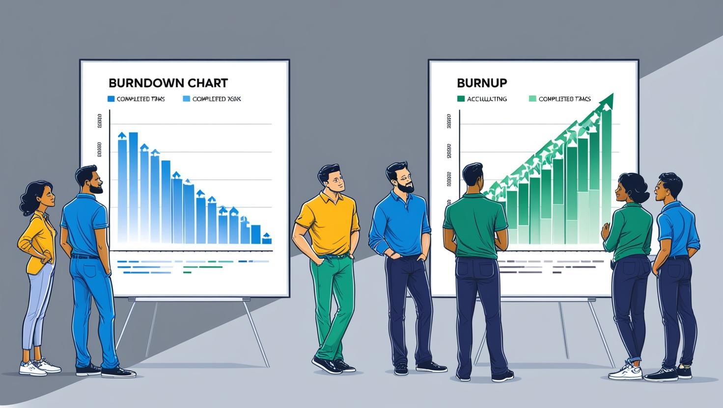
The burndown chart is a hallmark of Agile project management, providing a visually intuitive report of the work that needs to be accomplished versus time. In essence, it sketches the story of work ("burned down”) in relation to time, offering an extrapolated view of how quickly the team is chipping away at their to-do list.
Let’s consider a scenario where an Agile team has amassed a backlog of tasks. The total number of tasks is identified on the Y-axis, while the allocated time duration (usually in sprints) is represented along the X-axis. Initially, the burndown chart starts at the top of the Y-axis (total work to be done), and ideally, it should recede steadily down to the X-axis, symbolizing the completion of tasks over time.
In so doing, the burndown chart delivers a highly digestible, graphic presentation of the project’s progression, underlining whether the team is on track to meet deadlines within the given timeframe. If the downturn curve is reflective of the expected trajectory, then everything is as it should be. However, if deviations from the anticipated path emerge, it might signal issues warranting prompt attention.
Redefining the Role of the Burnup Chart
On the other side of the coin, let’s flip to the parallel universe of the burnup chart. A burnup chart is a similar visual tool that’s widely embraced within Agile project management. However, it depicts the total work completed, as opposed to work left undone (as is the case with the burndown chart). The burnup chart evolutionary tale is one of accumulation, reflecting the gradual completion of tasks over a specified period.
Delving deeper into its structural blueprint, the Y-axis epitomizes the overall effort required to accomplish the project. On the flip side, the X-axis displays time envisaged for project delivery. The chart begins at the origin (zero tasks completed), and as tasks are marked as done, the line on the chart climbs progressively upwards. The burnup chart illustrates the project’s journey towards completion while shedding light on the accumulated work done.
Demarcating Differences Between Burndown and Burnup Charts
As we’ve examined, even though both these charts are geared towards illuminating project trajectories, each one articulates a different narrative through their unique lens. Hence, they achieve their shared goal of tracking progress in slightly different ways.
- Storytelling Style: Burndown charts illustrate the journey of work that’s getting “burned down”. It’s about tracking the reduction of remaining tasks, offering a tale of completion by depletion. Conversely, burnup charts narrate the upward journey of task completion, building a story of increment and accumulation. In a nutshell, where one is about subtracting the tasks remaining, the other is about adding the completed tasks.
- Data Display: The burnup chart presents an added layer of granularity, providing a split-view of total scope (represented by a second line) and work done. On the other hand, a burndown is solely concerned with the work that is yet to be completed.
- Error Identification: With the help of combined visual aids—specifically the “ideal” trendline and the “actual” trendline—a burndown chart is relatively more straightforward in pinpointing problem areas. Conversely, burnup charts might require additional data analysis to outline the exact issues at play.
Deciding When to Use Which Chart
The choice of opting for the either of these charts boils down to the precise requirement of your Agile team and the unique dynamics of your project. Here are some determinants that can guide you in the decision-making process:
- If there’s a high likelihood of scope changes or the addition of new user stories in the middle of a sprint due to project dynamics, a burnup chart might serve better. It’s capable of reflecting scope changes without disrupting the work completed line, giving you a realistically updated view.
- On the other hand, if the project maintains a static scope where change is minimal or non-existent, then the burndown chart is the way to go. This chart is particularly beneficial if you want an uncluttered view of work remaining and a prediction of whether your team will meet its sprint deadline.
The Enabling Power of Burndown and Burnup Charts for Agile Teams
Both burndown and burnup charts are effective visual tools that enable Agile teams to gauge their performance, synchronize under one unified view, and streamline their paths. By translating data into meaningful visuals, these charts simplify understanding, stimulate conversation, and motivate action. They form the backdrop of sprint retrospectives, presenting a vivid recollection of “what happened” so teams may pivot their strategies effectively and enhance their efficiency for upcoming sprints.
In the end, the choice between burndown and burnup isn’t a winner takes all scenario. Both have their merits. The decision rests on the unique requirements of the project and the Agile team’s specific dynamics. These charts, in isolation or in tandem, serve as a lighthouse guiding your project’s voyage, keeping your team on the right course and shining a light on potential obstacles. In doing so, they enable Agile teams to evolve and adapt continually – setting new standards of collaboration, transparency, and success.


